Graphing checklist

Work through the following checklist when drawing a graph.
- Put the dependent variable on the y-axis and the independent variable on the x-axis. If you are asked to plot A against B, put A on the y-axis and B on the x-axis.
- Label the axes with the name of each variable.
- Next to each variable name, label the units in brackets if appropriate.
- Choose appropriate scales for each axis (see below for further details).
- Plot each point correctly according to the major and minor grid lines provided.
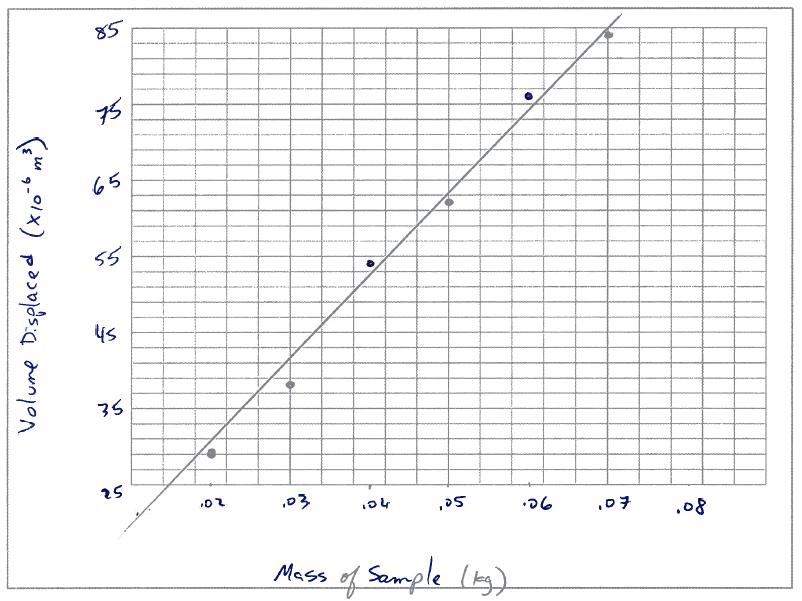
- Draw a suitable trend line. This may be straight or curved but plotted points should be evenly scattered on either side of it. In Physics, always extend any straight trend lines back to the axis.
- A title is good but not necessary. In a practical report, always provide a caption underneath a graph e.g. Figure 1: the period squared of a pendulum versus the mass.
Choosing axes scales
- Find the highest data value. Choose a scale that allows your data to be graphed as large as possible in the space provided. The scale should be large enough to reach the highest value without lots of extra space.
- In our Physics classes, always start the scale at zero and never break it. This is important since breaking or truncating the axis will make it difficult to read the y-intercept which we often want to read for calculations.
- The scale of each axis may be different but each one must be consistent. If one box represents one metre at the beginning of the graph, one box always represents one metre.
- Choose a scale that makes it easy to plot data correctly. Setting one box equal to 7 metres would make it hard to identify what one-fifth of that box represents and will lead to misplotted points.
Common mistakes

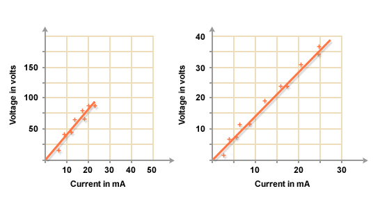
Each square on a scale should be worth the same value. Both scales here are incorrect.
The scales are not large enough for the space given. The trend line has not been extended back to the axis.
|
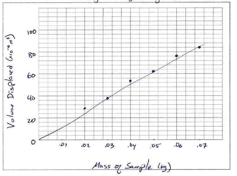
Do not fudge a trend line to pass through each point. Here, the trend is clearly linear.
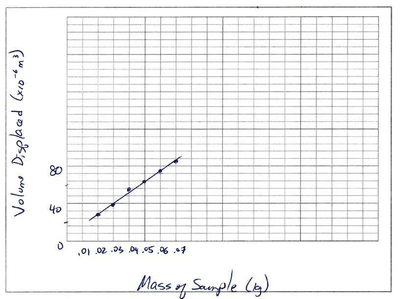
Here the y axis scale does not start at 0. This makes it difficult to determine the y intercept.
|
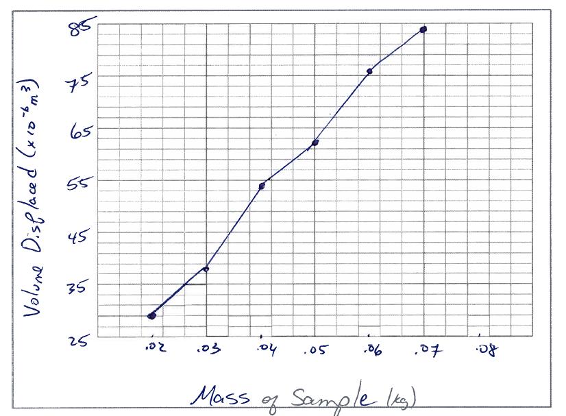
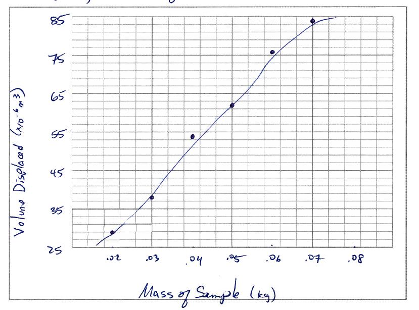
Never draw dot to dot trend lines.
Do not curve a trend line to try and force it through the origin. Also, always mark the axis values on major grid lines, not between them (on the x axis, the 0.1, 0.3, 0.5 etc. marks are unnecessary).
|

Do not break the scales at the start of the axis. Always start at 0 and go up in even intervals. The scale choices here also make it difficult to plot points correctly (here, each square on the x axis is worth 0.017)
Interpolating and Extrapolating
|
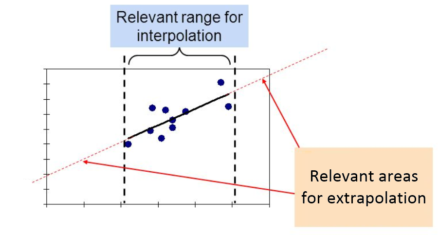
Besides being able to show trends between variables, plotting data on a graph allows us to predict values for which we have taken no data.
When we predict values that fall within the range of data points taken, it is called interpolation. When we predict values for points outside the range of data taken, it is called extrapolation. Extrapolation over too far a range can be unreliable unless it is certain that the observed relationship between the variables continues. Watch the video to learn how to interpolate and extrapolate. When doing this for tests, always rule in the lines that you used to deduce the answer. |
|
Choosing a graph type
|
Note that a scatter plot is not always the most appropriate graph to use. The nature of each variable affects how the data collected is best displayed.
Continuous numerical variable: A numerical variable that can have any number. If dependent and independent variables are both continuous, then the data can be represented by a scatter plot with a trend line. Discrete numerical variable: A variable that can only take a finite number of values such as the number of springs connected together. These can also be represented by a scatter plot but it often does not make sense to connect the points. Otherwise, a column graph can be used. Categorical variable: Something that can be described by a label and not a number, e.g. colour, or material of construction. These can be displayed as a column graph. |
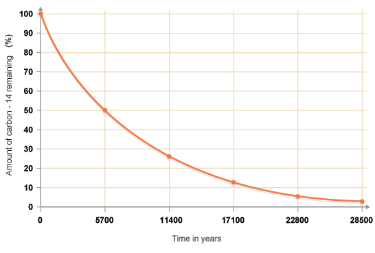
A scatter plot with a trend line for the continuous numerical variable of time in years
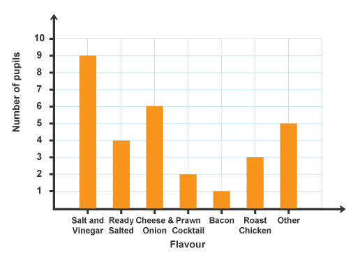
A column graph for the categorical variable of flavour
|
